
Spending Growth Index, 1963–2025: What the Two Measures Show
This report was produced by an AI model (Claude automated analysis, 5 October 2026) at Patrick Ishmael's direction. It has not been peer reviewed and has not been checked against the academic literature.
It extends the research idea of Millsap & Ishmael (2017), “State and local government spending growth and private sector GSP growth” — Adam Millsap is the coauthor of that original paper and the originator of the research idea with Patrick.
Full report (PDF, 27 pages) · Interactive standings explorer · Excel workbook (index, tables & charts) · State-year panel, 1963–2025 (CSV) · Analysis code
What this project is
In 2017, Adam Millsap and Patrick Ishmael published “State and local government spending growth and private sector GSP growth”, which built a simple index for each state: private-sector growth minus government growth, averaged over three years. A positive score means the private economy outgrew the government; a negative score means government outgrew the private economy.
This Special Project rebuilds that index from the original study window through the latest available data — 1963 to 2025 — on both of the paper's measures: BEA state and local government value added (mostly payroll), and Census direct general expenditures.
Five conclusions
- The paper's core warning holds. In 225 state-level private-sector slumps since 1967, states where government had been outpacing the private sector saw spending growth run 2.4 points a year below the national average over the next three years — 3.1 points where the spending share was also above average.
- The long-run trend the paper led with has reversed. State and local value added rose from 7.3% of output in 1963 to 10.0% in 2009, then fell to 7.8% in 2025 — the longest and largest decline in the series.
- Government changed form more than size. Each dollar of state and local value added came with $1.54 of direct spending in 1963 and $2.08 in 2024: governments increasingly finance services through payments and contracts rather than producing them with their own workforce.
- The federally funded share ratchets up with each cycle — and about half of the long-run rise in spending's share is federally funded.
- Rankings mean-revert. Florida rose from 47th to 1st on the ten-year standings while North Dakota fell from 1st to 50th. The correlation between a state's rank in one window and the next is negative.
What the rebuild shows
The index was built to flag states whose spending had outrun their private economies and could not be sustained once private growth fell. Tested over 61 years, that warning holds: when a state's private sector slumps, spending retrenches most where government had been growing faster and was already large. The backdrop has changed, though. The long-run rise in government's share that framed the 2017 paper has reversed on one measure, and on the other about half of it is federally funded.
Terms used in this report
| Term | Meaning |
|---|---|
| Index, or score | Private-sector growth minus government growth, in points a year. Positive means the private sector grew faster. |
| BEA measure, value added, payroll | State and local government value added from BEA, which is mostly payroll. |
| Census measure, spending | State and local direct general expenditure from Census. |
| Output | Private-industry output plus state and local government value added. |
| Own-funded spending | Spending minus federal aid. |
| Window | A three-year average, named by its final year unless a different length is stated. |
| Slump | A year in which a state's private growth ran at least 4 points below the average state. |
| Growth pattern | Which measure shows government outgrowing the private sector: private-led, spending-led, payroll-led or across the board. |
| Exposure | How hard spending would be to sustain in a slump: Very high, High, Moderate or Low. |
| Direction and size of gap | Whether spending or payroll is growing faster, and by how much: Very wide, Wide, Narrow or None. |
| Jurisdictions | The 50 states and the District of Columbia. |
Five conclusions
- The paper's core warning holds. In 225 state-level private-sector slumps since 1967, states where government had been outpacing the private sector saw spending growth run 2.4 points a year below the national average over the next three years. For other states the shortfall was 1.0 point. Where the spending share was also above average, it was 3.1 points. Alaska, the paper's lowest-ranked state on the Census measure for 2012–14, is the clearest case: after oil prices fell, its own-funded spending dropped 4.7% a year through 2019.
- The long-run trend the paper led with has reversed. State and local value added rose from 7.3% of output in 1963 to 10.0% in 2009, then fell to 7.8% in 2025. That is the longest and largest decline in the series, and it returns the share to within half a point of where it started. The paper's two snapshots sat at opposite ends of that arc. Its long-run chart ended in 2010, one year after the peak. Its featured 2012–14 index came from one of the most favorable stretches in 61 years, when only 7 jurisdictions were negative on the BEA measure and 9 on Census.
- Government changed form more than size. Each dollar of state and local value added came with $1.54 of direct spending in 1963 and $2.08 in 2024. Governments increasingly finance services through payments and contracts instead of producing them with their own workforce. The cross-state correlation between the two indices fell from 0.77 before 1997 to 0.59 since, which tracks that shift.
- The federally funded share ratchets up with each cycle. Federally funded spending was 2.5% of output in 1990, 3.0% in 2000, 3.4% in 2007, 3.7% in 2019 and 4.2% in 2024. Spending from states' own funds has moved between 11% and 14% of output since 1990 with no trend (12.8% in 1990, 12.3% in 2024). Much of what looks like state and local growth is federal growth carried out through the states.
- A score is a reading of the moment, and it matters most just before a slump. Private growth leads government growth by one to two years on both measures, and a state's score in one three-year window has no correlation with its score in the next. No state is persistently negative. The index is best read as a gauge of current exposure, which is how the paper used it.
The 2012–14 snapshot in context
The window the paper featured was close to the best reading the index has ever given, and states' positions have changed a great deal since. That makes it a useful marker for how much the conclusions depend on where in the cycle the picture is taken.
Few states were negative. The paper's tables show 8 jurisdictions negative on the BEA measure and 9 on Census for 2012–14. Rebuilt with revised data, the counts are 7 and 9. The window ending 2012 was lower still, at 3 and 5, the fewest on record to that point on BEA and level with the 1978 low on Census.
The cause was the cycle. The private sector was growing 4% to 5% a year in recovery. Government spending was growing 0.5% to 1.7% as recession aid ran off; federal aid fell 10% in 2012. The same mechanism in reverse had put 92% to 100% of jurisdictions in negative territory for the windows ending 2009 and 2010.
The paper's two exhibits pointed in opposite directions. Its long-run chart stopped in 2010, when the government share was 9.8% and one year past its all-time high. Its index covered 2012–14, when most states looked healthy. Neither was representative of the 61-year record.
States' growth patterns changed afterward. The 2012–14 ranking described its period accurately. Private-sector and government growth then shifted in most states, so the ranking today looks very different. A state's 2012–14 score has a correlation of 0.11 with its latest BEA score and 0.20 with its latest Census score. Between then and now, 18 jurisdictions changed sign on the BEA measure and 24 on Census.
| Jurisdiction | BEA rank, 2012–14 | BEA rank, 2023–25 | Census rank, 2012–14 | Census rank, 2022–24 |
|---|---|---|---|---|
| North Dakota | 1 | 51 | 1 | 3 |
| Oklahoma | 3 | 34 | 20 | 51 |
| Vermont | 36 | 5 | 48 | 13 |
| District of Columbia | 27 | 1 | 41 | 15 |
| Wyoming | 51 | 49 | 49 | 2 |
| Alaska | 50 | 45 | 51 | 21 |
| Missouri | 33 | 27 | 31 | 40 |
Ranks are from the rebuilt data, so the 2012–14 columns differ slightly from the paper's tables. The paper singled out North Dakota as the top performer, Wyoming and Alaska as among the weakest, and Vermont as persistently negative.
The trends split after the snapshot. From 2014 to the latest year, value added fell from 9.2% of output to 7.8%. Direct spending rose from 16.1% to 16.5%, and its federally funded part from 3.6% to 4.2%. In 2014 the two measures still told roughly the same story; the divergence that is now the main finding had not yet opened.
The 2015–16 oil bust tested the paper's flags. Six jurisdictions were negative on both measures in the paper: Alaska, Wyoming, Oregon, Vermont, Hawaii and DC. The private sector then fell in two of them.
| State | Paper's 2012–14 standing | Spending share of output, 2014 | Private output, 2016 vs 2014 | Direct spending, 2019 vs 2014 |
|---|---|---|---|---|
| Alaska | Last on Census, negative on both | 27.5% | −13% | −11% |
| Wyoming | Last on BEA, negative on both | 20.7% | −13% | +7% |
| North Dakota | First on both | 13.6% | −16% | +11% |
Across all states, direct spending grew about 19% over those five years. Alaska, with the weakest score and the largest government, cut outright. Wyoming's spending rose through 2016 and then stalled. North Dakota took the largest private-sector hit of the three, but it entered with the best score and a small government, and its spending kept rising. In Oregon, Vermont, Hawaii and DC the private sector kept growing, so the flag was never tested.
What this adds for researchers
These points go beyond the original project. The literature has not been reviewed for this report, so the positioning below should be checked against it before any of it is claimed as new.
- A three-way decomposition of government growth. Splitting the sector into value added, own-funded spending and federally funded spending gives three different trends from data most studies treat as one. The usual debate over whether government is growing gets a different answer for each.
- A new indicator: the ratio of spending to value added. It measures how far a government has moved from producing to financing. It is available by state and year from 1963, and it speaks to work on contracting out, on cost growth in labor-intensive services, and on Medicaid's role in state budgets.
- An own-funds index. Removing federal aid isolates the part of spending growth a state actually chooses and pays for. It gave a different reading from the total in the latest window: 42 jurisdictions negative against 27.
- A timing correction. Pairing June fiscal years with calendar years creates an apparent lead of one government measure over the other. Studies that mix Census fiscal-year data with BEA calendar-year data face the same artifact.
- A data-vintage caution. Census's published tables and its public-use files disagree by up to 10% for individual states in some years, depending on release date. Two independent rebuilds here matched only after reconciling vintages for 2012–15.
- A long, replicable panel. 51 jurisdictions, two measures, 1963–2025, built from public files with scripts and documented breaks in 1997, 2001 and 2003.
Three questions follow that the panel can support but this report does not answer:
- What fills the gap between spending and value added? Census reports spending by function, so Medicaid, capital and contracted services can be separated.
- Does the backfill of pandemic aid persist? If own-funded spending stays at its 2022–24 pace, federal aid will have raised the baseline of state spending. The 2025 and 2026 data will show it.
- Does a negative pre-recession score predict harder adjustment in general? The 2008–09 result needs testing with per capita, inflation-adjusted measures and controls for commodity exposure.
The five questions in brief
| Question | Answer |
|---|---|
| How are the two measures related? | Across states, the three-year scores correlate 0.69 on average and agree in sign 79% of the time. The link has weakened: 0.77 before 1997, 0.59 since. |
| Does one front-run the other? | No. Once the Census fiscal year is lined up with the calendar year, neither government measure leads. Private growth leads both by one to two years. |
| Has federal spending made it worse? | Yes, on the spending measure. Federal aid funds 26% of state and local direct spending, up from 13% in 1963, and accounts for about half the long-run rise in spending relative to the economy. |
| Is there a problem? | Yes on exposure. The rise in government's share that the paper documented through 2010 did not continue. Spending that outran the private sector was cut back hardest in state-level slumps. Government value added is 7.8% of output, near its 1963 level. Spending from states' own funds has shown no trend since 1990 (12.8% of output then, 12.3% in 2024). |
| Is it felt most in a downturn? | Yes. The index is negative in about 80% of state-years during recessions against 40% to 45% otherwise. The spending cuts arrive one to four years later, when federal aid recedes. |
The current reading is worth watching. In 2022–24, spending from states' own funds outgrew the private sector in 42 of 51 jurisdictions as pandemic aid ran off, against 27 on total spending.
How the two measures relate
The BEA and Census versions of the index tell the same story most of the time, and less so recently. Across the 51 jurisdictions, the three-year scores correlate 0.69 on average over 1966–2024. They agree on sign in 79% of state-windows.
| Period (window end) | Average cross-state correlation |
|---|---|
| 1966–1979 | 0.77 |
| 1980–1996 | 0.78 |
| 1997–2009 | 0.60 |
| 2010–2024 | 0.58 |
The low point was 0.26 for 2017–19, and the latest window, 2022–24, is 0.54.
Why they diverge. The BEA measure is value added, which is mostly payroll. The Census measure is all direct spending, including payments to health providers, purchased services and construction. Spending routed through outside providers raises the Census measure and leaves the BEA measure untouched. From 2019 to 2024, Census spending grew 6.9% a year and BEA value added 4.4%.
What the gap between the rankings measures
The two rankings differ because of what each measure includes, and that difference is a finding in its own right. Census spending covers everything BEA value added does not: purchased goods and services, payments to health providers, construction, aid to individuals and interest. A state's gap between its two scores is, by arithmetic, the growth rate of its ratio of spending to value added. It shows whether a government is growing through its payroll or through what it buys and pays out.
The rankings have drifted apart. A state's two ranks differed by 7.9 places on average before 1997, 9.6 from 1997 to 2009 and 11.3 since 2010. For 2022–24, 14 of 51 jurisdictions differ by more than 15 places.
| Direction of gap | Size of gap | Jurisdictions |
|---|---|---|
| Spending growing faster than payroll | Very wide (13) | Florida, Georgia, Illinois, New Mexico, Oklahoma, District of Columbia, Connecticut, Arizona, West Virginia, North Carolina, Massachusetts, Missouri, Rhode Island |
| Spending growing faster than payroll | Wide (19) | New Jersey, Vermont, Hawaii, Louisiana, Kentucky, New York, Nevada, Mississippi, Michigan, South Carolina, Indiana, Oregon, Kansas, Delaware, Pennsylvania, Washington, Maine, California, Texas |
| Spending growing faster than payroll | Narrow (11) | Wisconsin, Arkansas, South Dakota, Iowa, Nebraska, Alabama, Montana, Tennessee, Alaska, Virginia, Idaho |
| In step | None (5) | New Hampshire, Minnesota, Colorado, Ohio, Maryland |
| Payroll growing faster than spending | Narrow (2) | Wyoming, North Dakota |
| Payroll growing faster than spending | Wide (1) | Utah |
Each jurisdiction's figures and ranks are in Table A1 in the appendix. All figures are for 2022–24. Direction is set by the gap between spending growth and payroll growth: spending faster at +0.5 points a year or more, payroll faster at −0.5 or less, in step between. Size of gap is Narrow from 0.5 to 2 points, Wide from 2 to 4 and Very wide at 4 or more. Payroll here means government value added, which is mostly payroll. Ranks compare states with each other, so a state can sit far apart on the two rankings while its own spending and payroll grow in step, as in Ohio and Colorado. The section "Every state classified" below asks a different question: how each state's government growth compares with its private sector, using the terms growth pattern and exposure.
The latest window is an extreme. Spending is growing faster than payroll in 43 of 51 jurisdictions, and in 13 the gap is very wide. A gap of 4 points or more has occurred in only 6% of state-windows since 1966. The window ending 2022 had 48 jurisdictions spending-faster, the most on record. Nationally, spending per dollar of value added went from $1.85 in 2019 to $2.08 in 2024. So the size of a state's gap today is partly a national event: pandemic-era aid lifted spending while government payrolls grew more slowly than almost everything else.
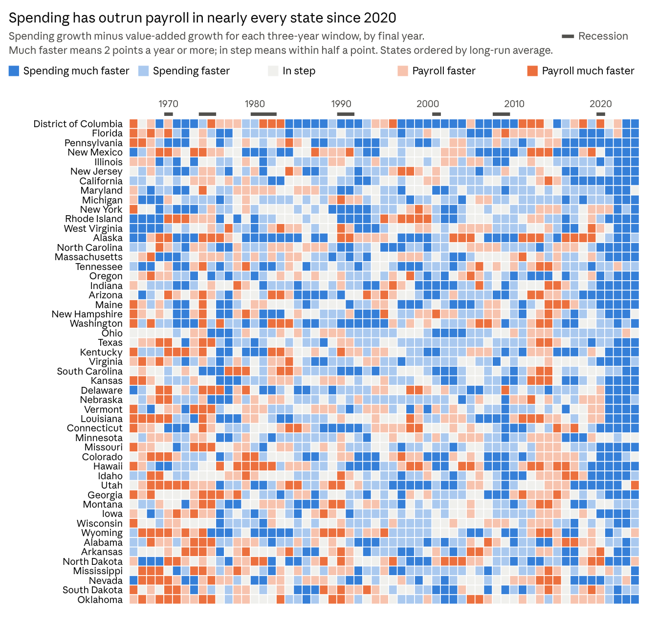
How states compare over time. Before 1980 there was no tilt either way; the average gap was −0.1 points a year. It was +0.6 in 1980–96, +0.8 in 1997–2009 and +1.0 in 2010–24. The gap also moves with the cycle. It widens in recession years (0.9 points against 0.5 in other years) and reversed after the 2008–09 aid ran off, when only 6 jurisdictions were spending-faster in 2011–13. Over the full record DC (+1.6), Florida (+1.1), Pennsylvania (+1.0) and New Mexico (+1.0) have the widest average gaps, and Oklahoma (−0.2) the narrowest. Missouri averages +0.5. Positions do not persist: a state's gap in one window has a correlation of −0.15 with its gap in the next.
Does it coincide with political composition? Changes in the gap do not. Adjusted for the year, the average gap under Democratic-controlled legislatures is 0.00 points from the national average, under Republican-controlled ones −0.02 and under split control +0.02. Its correlation with the Democratic share of seats is −0.02. The level of the ratio shows a modest link: since 1997, states with a larger Democratic seat share have had more spending per dollar of value added (correlation 0.21). But the level is tied more closely to income (0.41) and to the federal share of spending (0.52), and those travel with party, so the political link cannot be separated from them. The political data cover legislatures only, for 49 states through 2021.
Something else? Three things line up with the gap better than party does.
- National timing. About a fifth of all variation in the gap is shared by every state in a given window. The pandemic years account for the largest swing in the record.
- Federal aid. Year to year, the gap has a correlation of 0.24 with growth in a state's federal aid.
- Medicaid expansion, tentatively. In the 32 jurisdictions that expanded by 2016, spending per dollar of value added rose 4.8% from 2013 to 2019, against 2.5% elsewhere. In the three years after a state expanded, its gap widened by about half a point a year relative to the national average. Neither difference is statistically firm, and the expansion dates used here have not been verified.
Changes in the gap show no relationship with population growth, income, mining dependence, the size of government or private-sector growth; every correlation is below 0.1. The direct way to settle what is driving it is to split Census spending by function.
The ratio has risen almost everywhere. The median state spent $1.62 for each dollar of government value added in 1963, $1.68 in 2000 and $1.99 in 2024. It rose in 49 of 51 jurisdictions. In 2024 it ranged from 1.56 in Oklahoma to 2.72 in Pennsylvania; Missouri was at 2.11. Most of the rise has come since 2000.
Federal aid explains only part of it. Year to year, the gap between a state's two scores has a correlation of 0.24 with growth in its federal aid. The rest comes from how states spend their own money. Which categories are responsible is not yet known. Census reports spending by function, so health payments, construction and contracted services can be separated in a next step.
Read together, the two rankings give something neither gives alone. A state weak on both is expanding across the board. A state weak only on Census is expanding through purchases and payments while its workforce holds steady. A state weak only on BEA is adding payroll faster than total spending.
Does one lead the other?
Neither government measure front-runs the other. A raw comparison suggests BEA leads, but that is a calendar artifact: the Census fiscal year ends in June for most states, so fiscal year t overlaps calendar years t−1 and t equally.
| Census growth in fiscal year t compared with BEA growth in | Timing of BEA relative to Census | Within-state correlation |
|---|---|---|
| Calendar year t−2 | 18 months earlier | 0.14 |
| Calendar year t−1 | 6 months earlier | 0.26 |
| Calendar year t | 6 months later | 0.29 |
| Calendar year t+1 | 18 months later | 0.19 |
The pattern is close to symmetric around the fiscal year, so the two move together. At the index level the result is the same: a state's score on one measure in a three-year window says nothing about its score on the other in the next window (correlations of 0.03 and −0.13).
What does lead is the private sector. Private growth is followed by government growth one to two years later, on both measures.
| Private growth compared with government growth | BEA value added | Census spending |
|---|---|---|
| Same year | 0.15 | 0.11 |
| One year later | 0.27 | 0.22 |
| Two years later | 0.26 | 0.31 |
| Three years later | 0.19 | 0.23 |
This lag shapes the index. A state scores well while its private boom is under way and poorly a year or two later, when spending catches up or the private sector slows. Scores do not persist: a state's three-year score has essentially no correlation with its score in the following three years (−0.04 BEA, −0.12 Census).
All correlations in this section are within-state, after removing each state's average and each year's national average.
Every state classified
For 2022–24, 23 jurisdictions are private-led, 22 spending-led, 5 growing across the board and 1 payroll-led. On exposure to a private-sector slump, 8 rate Very high and 8 High. Missouri is spending-led with Moderate exposure.
Growth pattern says which measure shows government outpacing the private sector over the three-year window. There are four.
- Private-led: the private sector outgrew government on both measures.
- Spending-led: government outgrew the private sector on the Census measure only. Purchases and payments are growing faster than the economy while payroll is not.
- Payroll-led: government outgrew the private sector on the BEA measure only.
- Across the board: government outgrew the private sector on both.
Exposure is used in the paper's sense: how hard spending would be to sustain if the state's private sector slumped. The exposure score is the predicted growth in spending over the three years after a slump, relative to the average state, in points a year. It comes from the slump test and uses the two things that mattered there: the Census index and the spending share of output. Tiers are Very high (−1.0 or lower), High (−1.0 to −0.4), Moderate (−0.4 to +0.4) and Low (above +0.4).
| Exposure | Jurisdictions |
|---|---|
| Very high (8) | New Mexico, Oregon, Kentucky, Alaska, Oklahoma, Mississippi, West Virginia, California |
| High (8) | Louisiana, Hawaii, Illinois, Vermont, Michigan, Alabama, Maryland, Rhode Island |
| Moderate (16) | Kansas, Maine, Massachusetts, New York, Connecticut, North Carolina, Iowa, Missouri, Virginia, New Jersey, Wyoming, Indiana, Minnesota, Pennsylvania, Georgia, Wisconsin |
| Low (19) | Colorado, Washington, South Carolina, Nevada, South Dakota, Arizona, District of Columbia, Ohio, Arkansas, Florida, Utah, Tennessee, Delaware, North Dakota, Montana, Texas, Idaho, Nebraska, New Hampshire |
Each jurisdiction's score, growth pattern and underlying figures are in Table A2 in the appendix. Three notes on the classification. The tier cut-offs are a judgment call and can be moved. A large government raises exposure even when recent growth is favorable, which is why Alaska and Vermont rate Very high and High while private-led. And the score uses the Census index only; the BEA index enters through the growth pattern.
Growth patterns over time
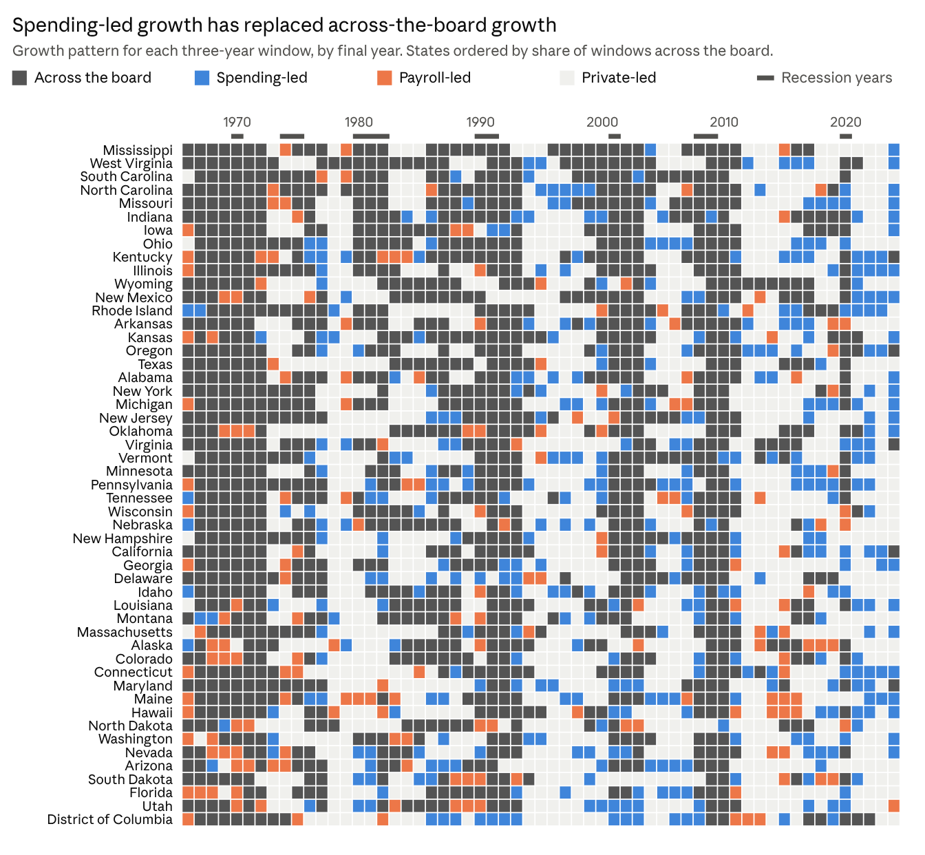
Across-the-board growth was the normal condition in the 1960s and 1970s and is now the exception. Spending-led growth has risen in every period and reached 43% of jurisdictions in the latest window.
| Period (window end) | Across the board | Private-led | Spending-led | Payroll-led |
|---|---|---|---|---|
| 1966–1979 | 58% | 25% | 6% | 11% |
| 1980–1996 | 46% | 36% | 12% | 6% |
| 1997–2009 | 43% | 37% | 17% | 3% |
| 2010–2024 | 22% | 51% | 22% | 6% |
The vertical bands in the chart are the national cycle: nearly every state turns dark together after a recession. Differences between states are in how long they stay there. Mississippi and West Virginia have been across the board in 59% of windows; DC, Arizona, Florida and Utah in 25% to 29%. Missouri is at 53%. Pennsylvania has been spending-led most often, in 29% of windows.
Does it track political composition?
No, not on the evidence available. This section compares the index and the growth patterns with the party makeup of each state's legislature from 1964 to 2021, for 49 states. Nebraska's legislature is nonpartisan and DC has none.
- Seat share. The Democratic share of legislative seats has a correlation of −0.03 with the index across states and 0.00 within a state over time, on both measures.
- Party control. After adjusting for the year, states with Republican-controlled legislatures were 1.2 points less likely than average to be across the board, and Democratic-controlled ones 1.2 points more likely. Since 1997 the gap is 2.6 points each way.
- Where that small gap comes from. Since 1997 the index has run 0.2 to 0.3 points higher under Republican legislatures. Spending growth was the same under both parties. The difference is slightly faster private growth.
- Changes in control. In the three years after a legislature moved to Republican control (92 cases), spending growth ran 0.5 points a year lower relative to the national trend, which is not distinguishable from zero. Private growth fell by more. After moves to Democratic control (70 cases), spending growth did not change.
- One weak signal. Own-funded spending grew about 0.5 points a year slower in the year after Republican control than under split control in the same state. It is the only political result that clears a conventional significance test.
This covers legislatures only. Governors' parties were not available in a usable form, the data end in 2021, and party labels meant different things in 1970 than in 2020, particularly in the South. Legislative data are from psthomas/state-partisan-composition, which combines Carl Klarner's historical series with National Conference of State Legislatures counts.
What it does track
A state's growth pattern follows its economy far more than its politics.
| Factor | What the data show |
|---|---|
| National cycle | 33% to 38% of all variation in three-year scores is shared by every state in a given window |
| The state's own private sector | Half of the remaining cross-state variation on Census and two-thirds on BEA comes from private growth, not government growth |
| Size of government | States with a larger spending share score lower (correlation −0.2) |
| Population and income | States most often across the board have slower population growth (−0.38) and lower income (−0.42) |
| Resource dependence and volatility | Spending-led patterns are rarer in mining states (−0.39) and volatile economies (−0.41); payroll-led patterns are more common in volatile ones (+0.41) |
| Federal aid share | No relationship (0.07) |
| Lasting state traits | 2% of variation; no state is persistently high or low |
The correlations in the table are across states and describe association only. Population and income in particular may be effects as much as causes.
Has federal spending made it worse?
Yes, on the spending measure: federal aid explains about half of the long-run rise in state and local spending relative to the economy. It also widens the swings around recessions.
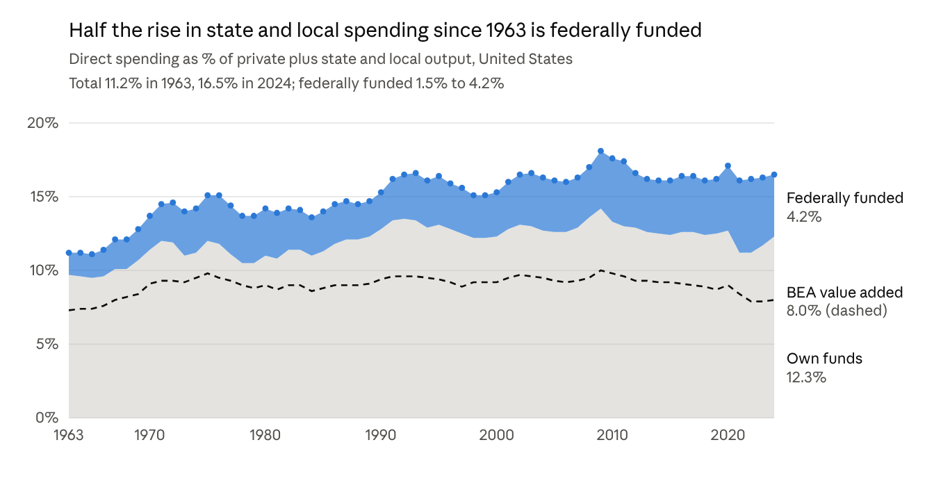
The long run. State and local direct spending rose from 11.2% of output in 1963 to 16.5% in 2024, a gain of 5.3 points. The federally funded part rose from 1.5% to 4.2%, or 2.7 of those points. Spending from states' own funds rose from 9.7% to 12.3%, and nearly all of that happened before 1990, when it was already 12.8%.
Federal aid as a share of spending. Aid paid for 13% of direct spending in 1963, 23% in 1980, 16% in 1990 and 23% in 2019. It peaked at 31% in 2022 and was 26% in 2024. Across states in 2024 it ranged from 19% in Kansas to 40% in Montana; Missouri was at 30%.
Growth rates by period (annual averages, nominal).
| Period | Private GSP | Spending from own funds | Federal aid |
|---|---|---|---|
| 1963–1980 | 9.1% | 10.0% | 14.2% |
| 1980–2000 | 6.9% | 7.5% | 6.5% |
| 2000–2019 | 4.0% | 4.1% | 5.2% |
| 2019–2024 | 6.6% | 6.0% | 9.5% |
Since 1980, spending from own funds has grown at close to the pace of the private economy. Federal aid has grown faster in three of the four periods.
The aid cycle. Federal aid surges in recessions and then recedes, and states' own spending moves the opposite way.
| Year | Private GSP | Federal aid | Spending from own funds |
|---|---|---|---|
| 2009 | −2.8% | +11.8% | +2.0% |
| 2010 | +4.1% | +16.0% | −2.2% |
| 2012 | +4.7% | −10.3% | +4.1% |
| 2020 | −1.3% | +19.6% | +0.2% |
| 2021 | +12.2% | +23.6% | −1.3% |
| 2022 | +10.5% | +11.9% | +10.0% |
| 2023 | +6.9% | −1.7% | +11.6% |
| 2024 | +5.4% | −2.9% | +10.4% |
The index looks different once aid is removed. For 2022–24, total spending outgrew the private sector in 27 jurisdictions. Spending from own funds did so in 42, because states were replacing expiring aid. Part of that is rebound: own-funded spending fell in 2021, and over the full 2019–24 span it outgrew the private sector in only 15.
Federal aid does not touch the BEA measure directly, since grants passed on to providers or contractors are not government value added. That is one reason the two measures have drifted apart.
Is there a problem?
The paper made two points, and the updated data bear out both. Its warning about exposure, that spending which outruns the private sector is hard to sustain when private growth falls, is supported. It also said that government growing faster than the private sector could not go on indefinitely. It did not: the rise the paper documented through 2010 stopped, and spending relative to output has softened since.
Spending relative to output has softened since the paper's endpoint. The paper's long-run chart ended in 2010. Since then every measure except the federally funded part has fallen.
| Measure, as a share of output | 2010 | Latest | Jurisdictions lower than in 2010 |
|---|---|---|---|
| Government value added (BEA) | 9.8% | 7.8% in 2025 | 49 of 51 |
| Direct spending (Census) | 17.7% | 16.5% in 2024 | 36 of 51 |
| Spending from own funds | 13.3% | 12.3% in 2024 | 38 of 51 |
| Federally funded spending | 4.3% | 4.2% in 2024 | not calculated |
The softening was not uniform or steady. Most of the fall in the spending share came by 2019, when it was 16.2%; it has edged up since, and 32 jurisdictions had a higher spending share in 2024 than in 2019. Oregon, New Mexico, Wyoming and Kentucky are the largest exceptions to the decline since 2010. Missouri's spending share went from 16.6% to 16.0% and its value-added share from 9.3% to 7.5%.
Which states have restrained government growth best?
Over the full record only 11 jurisdictions kept government growth at or below private growth, and a state's standing in one era says nothing about its standing in the next. The measure here is the average annual index, combining the BEA and Census versions, in points a year. Positive means the private sector outgrew government.
Strongest over 1964–2024. Alaska (+0.9), North Dakota (+0.6), South Dakota (+0.5), New Hampshire (+0.3), Florida (+0.3), Arizona (+0.2), Idaho, Tennessee and Colorado (+0.1 each), then Texas and Nebraska at zero.
Weakest. West Virginia (−1.1), Kentucky (−1.0), Mississippi (−0.9), New Jersey, New Mexico, Illinois and Michigan (−0.8 each), then Missouri and North Carolina (−0.7). Missouri ranks 44th.
Consistent across all three periods. North Dakota and Texas are in the top third in each. Illinois, Kentucky and West Virginia are in the bottom third in each. No other jurisdiction is consistently in either group.
An interactive version lets you follow any set of states over time on either measure, by rank or score: State standings explorer.
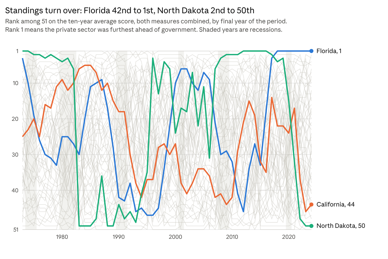
The three highlighted states show the range of paths. Florida fell to 47th in the mid-1990s and has been first for seven straight periods. North Dakota swings between the top and the bottom with oil: second as recently as 2010 and 50th now. California was in the top dozen through the 1980s, in the bottom half from 1992 to 2010, mid-table in the 2010s and is now 44th.
Standings for 2015–2024
Over the latest ten years the private sector outgrew government in 43 of 51 jurisdictions on the combined score. The two measures differ: 48 are positive on value added, but only 23 on spending. Scores are average annual points.
| Rank | Top ten | Combined score | Rank | Bottom ten | Combined score |
|---|---|---|---|---|---|
| 1 | Florida | +3.2 | 42 | Maryland | +0.1 |
| 2 | Idaho | +2.5 | 43 | Colorado | +0.1 |
| 3 | Arizona | +2.4 | 44 | California | −0.0 |
| 4 | New Hampshire | +2.2 | 45 | Minnesota | −0.0 |
| 5 | Tennessee | +1.9 | 46 | Louisiana | −0.2 |
| 6 | Arkansas | +1.9 | 47 | Oregon | −0.2 |
| 7 | South Carolina | +1.8 | 48 | New Mexico | −0.3 |
| 8 | Maine | +1.8 | 49 | District of Columbia | −0.5 |
| 9 | Montana | +1.8 | 50 | North Dakota | −1.0 |
| 10 | Georgia | +1.7 | 51 | Oklahoma | −1.4 |
Missouri is 22nd at +1.0. All 51 jurisdictions, with each measure shown separately, are in Table A4 in the appendix.
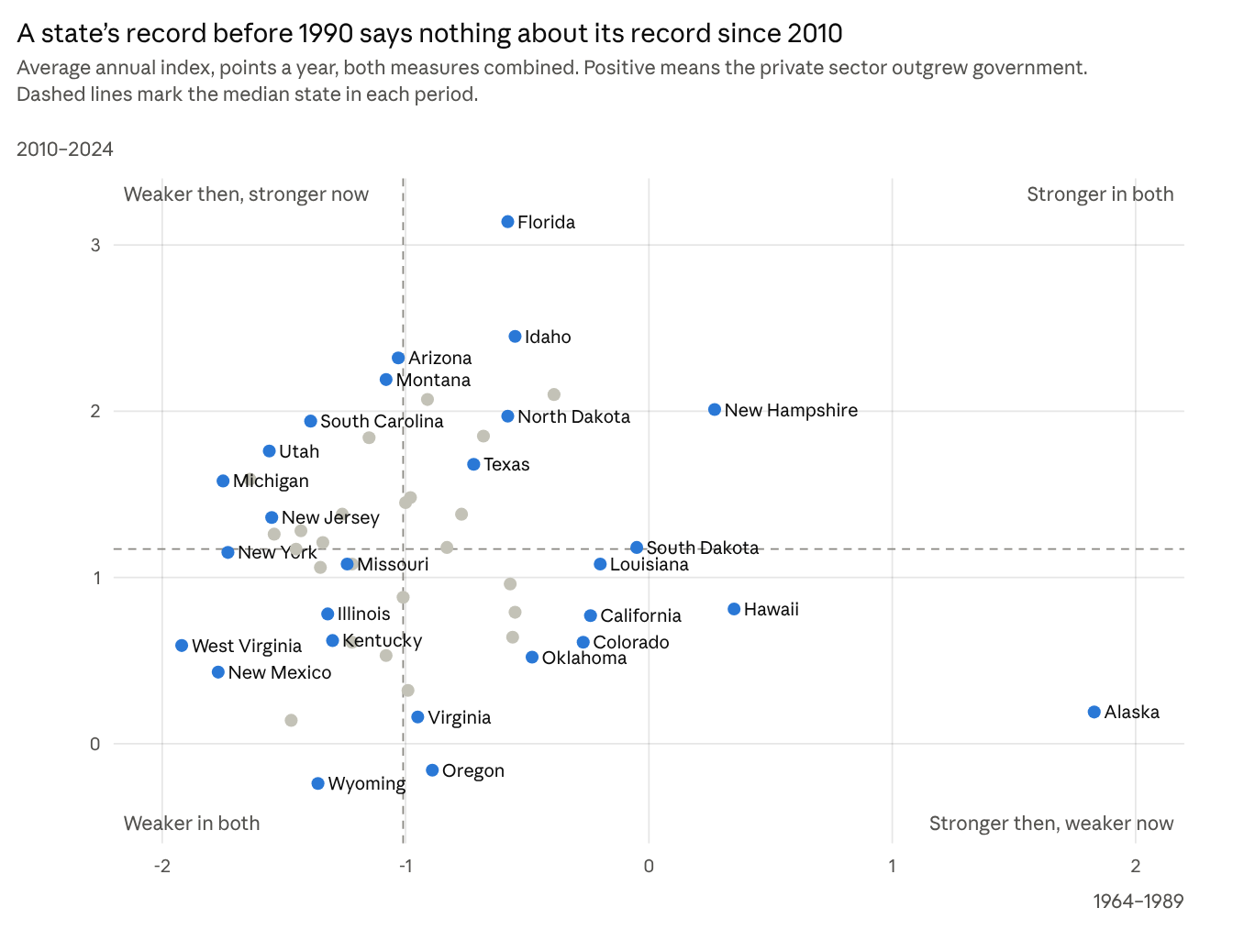
Stronger in the past, weaker now. Rank among the 51 in each period.
| Jurisdiction | 1964–1989 | 1990–2009 | 2010–2024 |
|---|---|---|---|
| Alaska | 1 | 6 | 47 |
| Hawaii | 2 | 50 | 34 |
| Louisiana | 5 | 40 | 29 |
| California | 6 | 37 | 37 |
| Colorado | 7 | 8 | 41 |
| Oklahoma | 9 | 24 | 44 |
| Kansas | 10 | 30 | 35 |
| Vermont | 12 | 44 | 38 |
| Oregon | 20 | 18 | 50 |
| Virginia | 22 | 10 | 48 |
Weak in the past, stronger now.
| Jurisdiction | 1964–1989 | 1990–2009 | 2010–2024 |
|---|---|---|---|
| Michigan | 49 | 38 | 15 |
| New York | 48 | 15 | 27 |
| Ohio | 47 | 36 | 14 |
| Utah | 46 | 5 | 12 |
| New Jersey | 45 | 46 | 20 |
| Mississippi | 44 | 49 | 22 |
| Pennsylvania | 41 | 31 | 21 |
| South Carolina | 40 | 47 | 9 |
| Montana | 28 | 14 | 4 |
| Arizona | 27 | 7 | 3 |
Three things to keep in mind when reading these.
- Ranks are relative. In absolute terms nearly every state did better after 2010. Government outgrew the private sector in 48 jurisdictions in 1964–1989 and in 42 in 1990–2009, but in only 2 in 2010–2024: Oregon and Wyoming.
- A strong score is mostly a strong private sector. The long-run score has a correlation of 0.69 with private growth. Florida since 2010 is the typical case: its private sector grew 1.3 points a year faster than the average state while its spending grew at the average rate. Alaska's first-place record rests on the oil boom of the 1970s and 1980s.
- Restraint on the spending side is rarer. New Hampshire since 2010 held spending growth 0.9 points a year below the average state with ordinary private growth. Oregon went the other way, with spending growth 2.1 points above average. Alaska cut spending 2.5 points a year relative to other states, but its private sector shrank by as much.
The full ranking by period is Table A3 in the appendix.
What the data do not show.
- A rising government share. State and local value added was 7.3% of output in 1963, peaked at 10.0% in 2009 and was 7.8% in 2025. Most of the rise came before 1970, and all of it has since reversed. The series changes industry definitions in 1997, which adds about 0.3 points.
- Unsustainable divergence. The paper said that government outgrowing the private sector year after year would be unsustainable, not that it would happen. The record agrees that it does not last. Over 61 years the average annual BEA index across states is −0.0001, effectively zero. Negative spells are followed by positive ones.
- Persistent offenders. A state's score in one window does not predict its score in the next. No state is negative in more than 63% of BEA windows or fewer than 35%.
- Harm. The index compares growth rates. It cannot show whether any state's spending is too high or whether it slowed private growth. States that ran negative scores before a recession did not have worse private-sector outcomes during it (correlations between −0.12 and 0.13 across four recessions).
What the data do show.
- Spending has grown relative to the economy even as payroll has not. Direct spending is 16.5% of output against 11.2% in 1963. Government is doing more through payments and contracts and less through its own workforce.
- About half of that growth is federally funded. States control less of their own spending base than they did, and that base is exposed to federal budget decisions.
- The Census index averages slightly negative. The average annual Census index is −0.006, which is how the spending share drifted up five points over six decades.
- Own-funded spending is now running hot. It grew 10% to 12% a year in 2022–24, against 5% to 10% for the private sector. Whether that is a one-time backfill of expiring aid or a new baseline is the open question.
Whether a spending share of 16.5% is too high is a judgment about what government should do. These measures cannot settle it.
Will it be felt most in a downturn?
Yes. The gap between government and private growth opens in recessions in nearly every state, and the adjustment follows one to four years later.
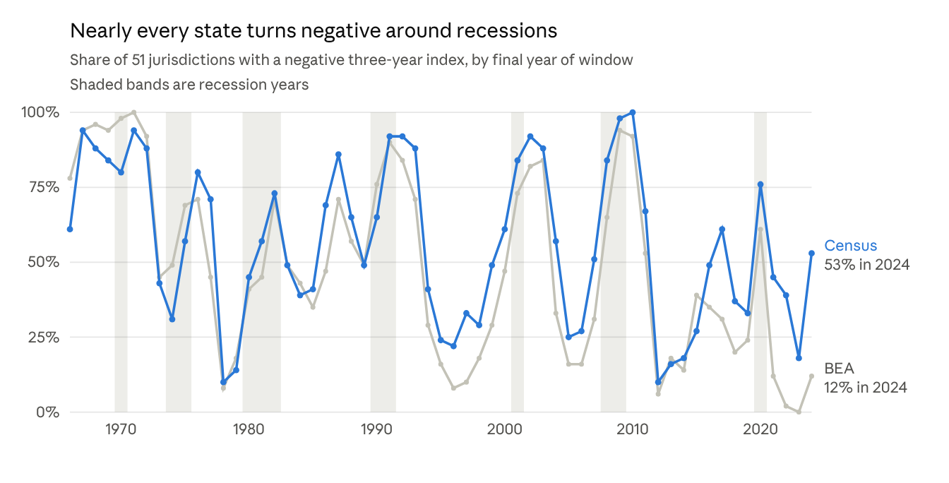
The gap opens everywhere. In recession years the annual index is negative in 79% of state-years on the BEA measure and 80% on the Census measure. In other years it is 40% and 45%. For the windows ending 2009 and 2010, between 92% and 100% of jurisdictions were negative on both measures.
The cause is the private sector falling, not spending rising. In 2009 private output fell 2.8% while direct spending rose 4.0%, close to its prior trend. Budgets are set before the downturn and take a year or two to respond, which is the same lag shown earlier.
The adjustment comes later. After the 2008–09 recession, direct spending grew between 0.5% and 1.7% a year from 2010 to 2013 while the private sector grew 4% to 5%. Federal aid delayed the squeeze and then sharpened it: aid rose 12% and 16% in 2009 and 2010, then fell 10% in 2012.
States that had been running negative adjusted more, at least once. After the 2008–09 recession, states where government had outpaced the private sector in 2004–07 saw slower government growth in 2009–12. The correlation between the earlier index and later government growth is 0.61 on the BEA measure and 0.41 on Census. This supports the paper's warning, but the evidence from other recessions is weak.
| Recession | BEA measure | Census measure |
|---|---|---|
| 1990–91 | 0.12 | 0.32 |
| 2001 | −0.35 | not available |
| 2008–09 | 0.61 | 0.41 |
| 2020 | 0.21 | 0.16 |
The table shows the correlation between a state's average index in the four years before each recession and its government growth in the years after. A positive value means states with weaker pre-recession scores had slower government growth afterward. The 2001 Census figure is missing because Census published no state totals for 2001 or 2003.
The better test: state-level slumps
National recessions are a blunt test of the paper's warning, because federal aid arrives and every state is hit at once. The warning is about what happens when a particular state's private sector weakens. Those episodes are far more common, and they support it.
A slump here is a year in which a state's private growth ran at least 4 points below the average of all states. There are 225 such state-years from 1967 to 2021. The table shows how direct spending grew over the following three years, relative to the all-state average.
| Three years before the slump | Spending share of output | State-years | Spending growth over next three years, vs. average |
|---|---|---|---|
| Government had outpaced private | Above average | 79 | −3.1 points a year |
| Government had outpaced private | Below average | 63 | −1.5 points a year |
| Private had outpaced government | Above average | 41 | −1.3 points a year |
| Private had outpaced government | Below average | 42 | −0.7 points a year |
Both of the paper's ingredients matter. Holding the size of the slump constant, each point of the pre-slump index is associated with 0.26 points a year of later spending growth, and a larger spending share with less. The correlation between the pre-slump index and later spending growth is 0.54 in slump years, against 0.34 in other years.
Three cautions apply. Slump years cluster in commodity states and often run consecutively, so these are not 225 independent events. Part of the relationship is ordinary reversion, since it also appears in non-slump years at about two-thirds the strength. And the result shows spending was not sustained; it does not show the earlier level was too high.
Do thrifty states weather slumps better?
On the budget side, yes. On the economic side, the data do not show it. The idea has three parts: small governments ride out a slump more easily, large ones can too if their spending has kept pace with their economies, and large ones need to cut quickly when it has not. Each can be checked against the 166 slump episodes in the record, counting each slump once at its first year.
Budgets: both thrift and proportion help. The table shows spending growth over the three years after a slump begins, relative to the average state.
| Size of government before the slump | Spending in line with the economy | Spending outrunning the economy |
|---|---|---|
| Small (below-average share of output) | −0.5 points a year | −1.3 points a year |
| Large (above-average share) | −1.1 points a year | −2.3 points a year |
A large government whose spending had kept pace with its economy came through about as well as a small one whose spending had not. The worst outcomes are where both conditions fail. Holding the size of the slump constant, both effects are statistically firm.
Economies: thrifty states did not recover faster. The next table shows private-sector growth over the same three years, relative to the average state.
| Size of government before the slump | Spending in line with the economy | Spending outrunning the economy |
|---|---|---|
| Small | −1.8 points a year | −1.5 points a year |
| Large | −0.5 points a year | −1.2 points a year |
States with larger governments rebounded somewhat faster, not slower. Part of that is commodity states, which have large spending shares and sharp recoveries; without them the pattern weakens but does not reverse. States whose spending had been in line with their economies recovered slightly faster over five years, but that result does not survive removing the commodity states.
Speed of adjustment: no measurable payoff. How quickly a state restrained spending in the first two years of a slump has no relationship with how its private sector did afterward. Among large-government states, those that held spending up early recovered marginally better, though not by a firm margin. What quick adjustment does show is in the spending share. Large governments that had been outrunning their economies brought the share back to within 0.2 points of its pre-slump level in five years. Small governments let it stay 0.7 to 1.5 points higher.
States differ a great deal in how responsive they are. For each point of private growth, spending in the median state moves 0.46 points over the next two years. South Carolina (1.16), Nevada (0.86) and Vermont (0.85) are the most responsive. Indiana (−0.10), Illinois (0.03) and Alabama (0.04) are the least. Missouri is at 0.38.
What this cannot test. Weathering a downturn well also means avoiding tax increases, credit downgrades, pension shortfalls and service failures. None of those are in this dataset, and neither are rainy-day funds or debt. The finding here is narrower: thrift and proportion protect the budget from sharp retrenchment, and there is no sign in these data that they speed the private recovery.
What the spending is for: North Dakota and California
The index treats all spending alike, but two states can earn the same score for different reasons, and the reasons bear on how hard the spending is to unwind.
North Dakota looks like catch-up. During the oil boom its capital outlays rose from about 16% of spending to 26% in 2016, when the national share was 12%, and it ranked first among the states. From 2008 to 2015 capital outlays nearly tripled while private output rose 82% and population 16%. Capital kept rising for two years after oil prices fell, then dropped 32% by 2019. That is the pattern of projects begun for a boom being finished and then ending. It helps explain why the state scored so poorly in 2015–16 yet did not face the cuts Alaska did.
California is a different case. Its capital outlays are 10% of spending, among the lowest shares in the country. What has grown is public welfare, the Census category that is mostly Medicaid payments to providers. It went from 17% of California's spending in 2012 to 25% in 2024 and accounts for about a third of the state's spending increase over that period.
| Share of direct spending | North Dakota | California | All states |
|---|---|---|---|
| Capital outlays, 2024 | 19% | 10% | 12% |
| Public welfare, 2012 | 14% | 17% | 19% |
| Public welfare, 2024 | 17% | 25% | 23% |
| Share of the 2012–24 spending increase from public welfare | 22% | 32% | 29% |
Why the difference may matter. A capital program winds down when the projects are built. It also serves the private economy that prompted it, so some of its cost may come back as growth. A benefit program is a standing commitment to the people enrolled, it tends to grow in a downturn, and much of it is federally matched, so a state that cuts a dollar of its own money gives up federal money with it. Its returns are of a different kind, in health and household security, and are unlikely to show up as private output in the way a road or a water system might. Several of the states with the highest exposure ratings resemble California more than North Dakota: public welfare is 28% to 33% of spending in Oregon, New Mexico and Kentucky, and it accounts for 37% to 47% of their spending increase since 2012.
This is offered as a reading, not a finding. The index does not separate spending by purpose, public welfare is broader than Medicaid, and nothing here measures the return on either kind of spending.
Exposure going into the next one. Two things differ from 2007. Federal aid is a larger share of spending (26% against 21%), and own-funded spending has just grown faster than the private sector in 42 jurisdictions. A recession arriving now would hit budgets that have recently absorbed the loss of pandemic aid, with less room to absorb a fall in revenue. Whether Congress repeats the 2009 and 2020 aid surges would decide how soon the squeeze arrives.
Method, data and limits
The analysis uses the merged version 2 panel for 50 states and DC, with one addition: federal aid by state, which is new here and not yet in the workbook.
- Index. Annual growth of private-industry GSP minus annual growth of the government measure, averaged over three years. Positive means the private sector grew faster. All growth is nominal.
- BEA measure. State and local government value added, 1963–2025.
- Census measure. State and local direct general expenditure, fiscal years 1963–2024.
- Federal aid. Census intergovernmental revenue from the federal government, state and local combined, taken from the same sources and vintages as the spending series.
- Spending from own funds. Direct general expenditure minus federal aid. This is an approximation: aid received in a year is not always spent that year, which matters most for 2021–22.
- Output. Private-industry GSP plus state and local value added, the denominator used in the paper's Figure 1.
- Recession years. 1970, 1974–75, 1980–82, 1990–91, 2001, 2008–09 and 2020.
- Lead and lag correlations. Computed on annual growth rates after removing state and year averages. Growth for 2001–2004 is excluded because 2001 and 2003 are interpolated.
Limits to keep in mind:
- Correlations here describe timing and association. None of them identifies cause.
- Recession-year averages are not adjusted for inflation, and most recession years before 1991 were high-inflation years. The share-negative figures are unaffected, since the index is a difference of two nominal rates.
- The US shares in the first chart use the original Census extract rather than the merged panel. The two differ by well under 1% nationally.
- Earlier caveats still apply: the 1997 change in industry definitions, vintage differences in the 2017–2022 Census files, and first-estimate BEA data for 2025.
Sources: BEA regional accounts, tables SAGDP2 and SAGDP2S; Census Bureau Annual Survey of State and Local Government Finances, historical database, Table 1 and public-use files. All downloaded 5 October 2026.
Appendix: full state tables
The four tables below give every jurisdiction's figures. Each is summarized in the section named in its heading.
Table A1. Spending against payroll, 2022–24
From "What the gap between the rankings measures." Ordered from the widest gap toward spending to the widest toward payroll. Gap is spending growth minus payroll growth.
| Jurisdiction | Direction of gap | Size of gap | Gap, points a year | BEA rank | Census rank | Spending per $1 of value added, 2024 | Change in ratio since 2019 |
|---|---|---|---|---|---|---|---|
| Florida | Spending faster than payroll | Very wide | +5.7 | 1 | 14 | $2.46 | +16% |
| Georgia | Spending faster than payroll | Very wide | +5.6 | 17 | 44 | $1.99 | +22% |
| Illinois | Spending faster than payroll | Very wide | +5.5 | 33 | 50 | $2.27 | +26% |
| New Mexico | Spending faster than payroll | Very wide | +5.2 | 14 | 41 | $2.26 | +30% |
| Oklahoma | Spending faster than payroll | Very wide | +4.9 | 41 | 51 | $1.56 | +17% |
| District of Columbia | Spending faster than payroll | Very wide | +4.8 | 2 | 15 | $4.45 | +5% |
| Connecticut | Spending faster than payroll | Very wide | +4.6 | 35 | 48 | $1.96 | +17% |
| Arizona | Spending faster than payroll | Very wide | +4.5 | 6 | 19 | $1.98 | +20% |
| West Virginia | Spending faster than payroll | Very wide | +4.4 | 11 | 26 | $2.19 | +16% |
| North Carolina | Spending faster than payroll | Very wide | +4.3 | 19 | 39 | $1.98 | +18% |
| Massachusetts | Spending faster than payroll | Very wide | +4.2 | 34 | 45 | $2.47 | +24% |
| Missouri | Spending faster than payroll | Very wide | +4.0 | 23 | 40 | $2.11 | +16% |
| Rhode Island | Spending faster than payroll | Very wide | +4.0 | 10 | 20 | $2.57 | +22% |
| New Jersey | Spending faster than payroll | Wide | +3.9 | 21 | 38 | $2.09 | +15% |
| Vermont | Spending faster than payroll | Wide | +3.9 | 5 | 13 | $2.51 | +22% |
| Hawaii | Spending faster than payroll | Wide | +3.8 | 13 | 25 | $2.30 | +24% |
| Louisiana | Spending faster than payroll | Wide | +3.4 | 38 | 43 | $2.30 | +18% |
| Kentucky | Spending faster than payroll | Wide | +3.2 | 46 | 49 | $2.47 | +25% |
| New York | Spending faster than payroll | Wide | +2.9 | 29 | 37 | $2.03 | +7% |
| Nevada | Spending faster than payroll | Wide | +2.9 | 26 | 33 | $1.84 | +8% |
| Mississippi | Spending faster than payroll | Wide | +2.9 | 22 | 27 | $1.97 | +8% |
| Michigan | Spending faster than payroll | Wide | +2.8 | 39 | 42 | $2.21 | +9% |
| South Carolina | Spending faster than payroll | Wide | +2.8 | 4 | 8 | $1.82 | +12% |
| Indiana | Spending faster than payroll | Wide | +2.8 | 25 | 29 | $2.36 | +18% |
| Oregon | Spending faster than payroll | Wide | +2.7 | 48 | 46 | $2.08 | +13% |
| Kansas | Spending faster than payroll | Wide | +2.6 | 37 | 36 | $1.93 | +16% |
| Delaware | Spending faster than payroll | Wide | +2.5 | 8 | 10 | $2.10 | +13% |
| Pennsylvania | Spending faster than payroll | Wide | +2.5 | 18 | 17 | $2.72 | +15% |
| Washington | Spending faster than payroll | Wide | +2.3 | 28 | 28 | $1.68 | +12% |
| Maine | Spending faster than payroll | Wide | +2.3 | 30 | 30 | $2.25 | +10% |
| California | Spending faster than payroll | Wide | +2.1 | 50 | 47 | $2.14 | +12% |
| Texas | Spending faster than payroll | Wide | +2.1 | 12 | 9 | $1.88 | +9% |
| Wisconsin | Spending faster than payroll | Narrow | +2.0 | 20 | 16 | $1.87 | +7% |
| Arkansas | Spending faster than payroll | Narrow | +1.7 | 7 | 7 | $1.93 | +5% |
| South Dakota | Spending faster than payroll | Narrow | +1.5 | 32 | 22 | $1.81 | +14% |
| Iowa | Spending faster than payroll | Narrow | +1.4 | 42 | 32 | $1.90 | +12% |
| Nebraska | Spending faster than payroll | Narrow | +1.4 | 9 | 5 | $1.57 | +13% |
| Alabama | Spending faster than payroll | Narrow | +1.3 | 43 | 31 | $1.87 | +6% |
| Montana | Spending faster than payroll | Narrow | +1.3 | 3 | 1 | $1.94 | +5% |
| Tennessee | Spending faster than payroll | Narrow | +1.2 | 31 | 18 | $1.82 | +2% |
| Alaska | Spending faster than payroll | Narrow | +0.9 | 40 | 21 | $2.24 | +19% |
| Virginia | Spending faster than payroll | Narrow | +0.7 | 47 | 34 | $1.97 | +13% |
| Idaho | Spending faster than payroll | Narrow | +0.5 | 16 | 6 | $1.80 | +5% |
| New Hampshire | In step | None | +0.2 | 15 | 4 | $1.91 | +11% |
| Minnesota | In step | None | +0.2 | 44 | 23 | $2.08 | +7% |
| Colorado | In step | None | +0.0 | 45 | 24 | $1.90 | +10% |
| Ohio | In step | None | +0.0 | 36 | 12 | $1.99 | +2% |
| Maryland | In step | None | −0.2 | 51 | 35 | $2.12 | +6% |
| Wyoming | Payroll faster than spending | Narrow | −0.9 | 24 | 2 | $1.90 | +8% |
| North Dakota | Payroll faster than spending | Narrow | −1.2 | 27 | 3 | $1.99 | +8% |
| Utah | Payroll faster than spending | Wide | −2.2 | 49 | 11 | $1.89 | −1% |
Table A2. Exposure and growth pattern, 2022–24
From "Every state classified." Ordered from highest exposure to lowest.
| Jurisdiction | Exposure | Growth pattern | Exposure score | BEA index, 2022–24 | Census index, 2022–24 | Spending share of output | Federal aid share of spending |
|---|---|---|---|---|---|---|---|
| New Mexico | Very high | Spending-led | −2.4 | 0.036 | −0.015 | 28.0% | 36% |
| Oregon | Very high | Across the board | −1.8 | −0.002 | −0.029 | 23.0% | 26% |
| Kentucky | Very high | Across the board | −1.6 | −0.001 | −0.033 | 21.7% | 36% |
| Alaska | Very high | Private-led | −1.4 | 0.011 | 0.002 | 25.4% | 34% |
| Oklahoma | Very high | Spending-led | −1.2 | 0.010 | −0.039 | 18.3% | 33% |
| Mississippi | Very high | Spending-led | −1.1 | 0.026 | −0.002 | 23.2% | 35% |
| West Virginia | Very high | Spending-led | −1.0 | 0.042 | −0.002 | 22.8% | 34% |
| California | Very high | Across the board | −1.0 | −0.009 | −0.030 | 18.7% | 21% |
| Louisiana | High | Spending-led | −0.9 | 0.014 | −0.020 | 19.4% | 38% |
| Hawaii | High | Spending-led | −0.8 | 0.036 | −0.002 | 21.7% | 23% |
| Illinois | High | Spending-led | −0.8 | 0.016 | −0.039 | 16.5% | 22% |
| Vermont | High | Private-led | −0.8 | 0.054 | 0.015 | 23.7% | 29% |
| Michigan | High | Spending-led | −0.6 | 0.013 | −0.016 | 18.3% | 30% |
| Alabama | High | Spending-led | −0.5 | 0.008 | −0.005 | 19.6% | 31% |
| Maryland | High | Across the board | −0.5 | −0.011 | −0.009 | 19.1% | 25% |
| Rhode Island | High | Private-led | −0.5 | 0.042 | 0.002 | 20.5% | 30% |
| Kansas | Moderate | Spending-led | −0.4 | 0.015 | −0.011 | 18.0% | 19% |
| Maine | Moderate | Spending-led | −0.4 | 0.018 | −0.004 | 18.8% | 30% |
| Massachusetts | Moderate | Spending-led | −0.3 | 0.016 | −0.026 | 15.5% | 24% |
| New York | Moderate | Spending-led | −0.2 | 0.019 | −0.011 | 17.3% | 29% |
| Connecticut | Moderate | Spending-led | −0.1 | 0.016 | −0.030 | 14.1% | 25% |
| North Carolina | Moderate | Spending-led | −0.1 | 0.030 | −0.014 | 16.2% | 27% |
| Iowa | Moderate | Spending-led | −0.1 | 0.009 | −0.006 | 17.2% | 25% |
| Missouri | Moderate | Spending-led | −0.1 | 0.026 | −0.014 | 16.0% | 30% |
| Virginia | Moderate | Across the board | −0.1 | −0.001 | −0.008 | 16.8% | 21% |
| New Jersey | Moderate | Spending-led | −0.1 | 0.027 | −0.013 | 16.2% | 24% |
| Wyoming | Moderate | Private-led | −0.1 | 0.026 | 0.034 | 22.6% | 30% |
| Indiana | Moderate | Spending-led | +0.1 | 0.023 | −0.004 | 16.2% | 29% |
| Minnesota | Moderate | Private-led | +0.2 | 0.003 | 0.001 | 16.8% | 26% |
| Pennsylvania | Moderate | Private-led | +0.2 | 0.032 | 0.007 | 17.6% | 29% |
| Georgia | Moderate | Spending-led | +0.2 | 0.033 | −0.022 | 13.5% | 25% |
| Wisconsin | Moderate | Private-led | +0.4 | 0.027 | 0.008 | 16.5% | 23% |
| Colorado | Low | Private-led | +0.4 | 0.001 | 0.001 | 15.3% | 22% |
| Washington | Low | Spending-led | +0.5 | 0.019 | −0.004 | 14.2% | 23% |
| South Carolina | Low | Private-led | +0.5 | 0.054 | 0.026 | 18.3% | 25% |
| Nevada | Low | Spending-led | +0.6 | 0.023 | −0.006 | 13.7% | 26% |
| South Dakota | Low | Private-led | +0.7 | 0.017 | 0.002 | 14.2% | 30% |
| Arizona | Low | Private-led | +0.7 | 0.051 | 0.006 | 14.7% | 37% |
| District of Columbia | Low | Private-led | +0.7 | 0.059 | 0.011 | 15.3% | 39% |
| Ohio | Low | Private-led | +0.8 | 0.016 | 0.015 | 15.6% | 30% |
| Arkansas | Low | Private-led | +0.8 | 0.045 | 0.028 | 17.1% | 37% |
| Florida | Low | Private-led | +0.8 | 0.069 | 0.012 | 14.8% | 23% |
| Utah | Low | Payroll-led | +0.9 | −0.006 | 0.016 | 15.0% | 23% |
| Tennessee | Low | Private-led | +1.0 | 0.018 | 0.006 | 13.0% | 30% |
| Delaware | Low | Private-led | +1.1 | 0.044 | 0.018 | 14.3% | 26% |
| North Dakota | Low | Private-led | +1.2 | 0.020 | 0.032 | 15.7% | 26% |
| Montana | Low | Private-led | +1.2 | 0.057 | 0.045 | 17.3% | 40% |
| Texas | Low | Private-led | +1.3 | 0.039 | 0.019 | 13.1% | 22% |
| Idaho | Low | Private-led | +1.3 | 0.034 | 0.029 | 14.5% | 26% |
| Nebraska | Low | Private-led | +1.5 | 0.043 | 0.029 | 13.4% | 25% |
| New Hampshire | Low | Private-led | +1.8 | 0.034 | 0.032 | 12.4% | 23% |
Table A3. Restraint by period, 1964–2024
From "Which states have restrained government growth best?" Average annual index, both measures combined, in points a year, with rank among the 51 in each period.
| Jurisdiction | Full record, 1964–2024 | Rank | 1964–1989 | Rank | 1990–2009 | Rank | 2010–2024 | Rank |
|---|---|---|---|---|---|---|---|---|
| Alaska | +0.9 | 1 | +1.8 | 1 | +0.3 | 6 | +0.2 | 47 |
| North Dakota | +0.6 | 2 | −0.6 | 14 | +1.1 | 2 | +2.0 | 8 |
| South Dakota | +0.5 | 3 | −0.0 | 4 | +0.6 | 4 | +1.2 | 24 |
| New Hampshire | +0.3 | 4 | +0.3 | 3 | −0.8 | 29 | +2.0 | 7 |
| Florida | +0.3 | 5 | −0.6 | 15 | −0.7 | 23 | +3.1 | 1 |
| Arizona | +0.2 | 6 | −1.0 | 27 | +0.3 | 7 | +2.3 | 3 |
| Idaho | +0.1 | 7 | −0.6 | 11 | −0.8 | 25 | +2.5 | 2 |
| Tennessee | +0.1 | 8 | −0.4 | 8 | −0.8 | 26 | +2.1 | 5 |
| Colorado | +0.1 | 9 | −0.3 | 7 | +0.2 | 8 | +0.6 | 41 |
| Texas | +0.0 | 10 | −0.7 | 17 | −0.3 | 13 | +1.7 | 13 |
| Nebraska | +0.0 | 11 | −1.1 | 30 | +0.1 | 9 | +1.8 | 11 |
| Montana | −0.0 | 12 | −1.1 | 28 | −0.3 | 14 | +2.2 | 4 |
| Georgia | −0.0 | 13 | −0.9 | 21 | −0.5 | 20 | +2.1 | 6 |
| District of Columbia | −0.0 | 14 | −1.5 | 43 | +1.7 | 1 | +0.1 | 49 |
| Utah | −0.1 | 15 | −1.6 | 46 | +0.4 | 5 | +1.8 | 12 |
| Washington | −0.2 | 16 | −0.7 | 16 | −1.0 | 34 | +1.8 | 10 |
| Hawaii | −0.2 | 17 | +0.3 | 2 | −1.7 | 50 | +0.8 | 34 |
| Massachusetts | −0.2 | 18 | −0.6 | 13 | −0.6 | 21 | +1.0 | 32 |
| Louisiana | −0.2 | 19 | −0.2 | 5 | −1.2 | 40 | +1.1 | 29 |
| Minnesota | −0.3 | 20 | −1.0 | 26 | −0.2 | 12 | +0.9 | 33 |
| California | −0.3 | 21 | −0.2 | 6 | −1.2 | 37 | +0.8 | 37 |
| Nevada | −0.3 | 22 | −1.0 | 25 | −0.7 | 22 | +1.4 | 17 |
| Kansas | −0.3 | 23 | −0.5 | 10 | −0.8 | 30 | +0.8 | 35 |
| Oklahoma | −0.3 | 24 | −0.5 | 9 | −0.7 | 24 | +0.5 | 44 |
| Maine | −0.4 | 25 | −1.0 | 23 | −0.9 | 32 | +1.5 | 16 |
| Connecticut | −0.4 | 26 | −1.1 | 29 | −0.1 | 11 | +0.5 | 43 |
| Delaware | −0.4 | 27 | −0.8 | 19 | −1.0 | 33 | +1.2 | 25 |
| Virginia | −0.4 | 28 | −0.9 | 22 | −0.1 | 10 | +0.2 | 48 |
| Wyoming | −0.4 | 29 | −1.4 | 39 | +0.7 | 3 | −0.2 | 51 |
| Iowa | −0.4 | 30 | −1.3 | 38 | −0.4 | 16 | +1.1 | 31 |
| Wisconsin | −0.5 | 31 | −1.3 | 34 | −0.8 | 28 | +1.4 | 19 |
| Maryland | −0.5 | 32 | −1.0 | 24 | −0.4 | 17 | +0.3 | 46 |
| Arkansas | −0.5 | 33 | −0.8 | 18 | −1.5 | 48 | +1.4 | 18 |
| Vermont | −0.5 | 34 | −0.6 | 12 | −1.4 | 44 | +0.6 | 38 |
| Oregon | −0.6 | 35 | −0.9 | 20 | −0.4 | 18 | −0.2 | 50 |
| Pennsylvania | −0.6 | 36 | −1.4 | 41 | −0.8 | 31 | +1.3 | 21 |
| New York | −0.6 | 37 | −1.7 | 48 | −0.4 | 15 | +1.2 | 27 |
| South Carolina | −0.6 | 38 | −1.4 | 40 | −1.5 | 47 | +1.9 | 9 |
| Indiana | −0.6 | 39 | −1.3 | 37 | −1.1 | 35 | +1.2 | 23 |
| Rhode Island | −0.6 | 40 | −1.2 | 31 | −0.8 | 27 | +0.6 | 40 |
| Ohio | −0.7 | 41 | −1.6 | 47 | −1.1 | 36 | +1.6 | 14 |
| Alabama | −0.7 | 42 | −1.2 | 32 | −1.3 | 43 | +1.1 | 30 |
| North Carolina | −0.7 | 43 | −1.4 | 42 | −1.2 | 39 | +1.2 | 26 |
| Missouri | −0.7 | 44 | −1.2 | 33 | −1.4 | 45 | +1.1 | 28 |
| Michigan | −0.8 | 45 | −1.8 | 49 | −1.2 | 38 | +1.6 | 15 |
| Illinois | −0.8 | 46 | −1.3 | 36 | −1.3 | 41 | +0.8 | 36 |
| New Mexico | −0.8 | 47 | −1.8 | 50 | −0.5 | 19 | +0.4 | 45 |
| New Jersey | −0.8 | 48 | −1.5 | 45 | −1.5 | 46 | +1.4 | 20 |
| Mississippi | −0.9 | 49 | −1.5 | 44 | −1.6 | 49 | +1.3 | 22 |
| Kentucky | −1.0 | 50 | −1.3 | 35 | −1.7 | 51 | +0.6 | 39 |
| West Virginia | −1.1 | 51 | −1.9 | 51 | −1.3 | 42 | +0.6 | 42 |
Table A4. Standings for 2015–2024
From “Standings for 2015–2024.” Ten-year average annual scores, in points a year.
| Rank | Jurisdiction | Combined score | Value added (BEA) | Spending (Census) |
|---|---|---|---|---|
| 1 | Florida | +3.2 | +4.9 | +1.5 |
| 2 | Idaho | +2.5 | +2.7 | +2.3 |
| 3 | Arizona | +2.4 | +3.8 | +1.0 |
| 4 | New Hampshire | +2.2 | +3.2 | +1.3 |
| 5 | Tennessee | +1.9 | +2.5 | +1.4 |
| 6 | Arkansas | +1.9 | +2.3 | +1.5 |
| 7 | South Carolina | +1.8 | +2.6 | +1.1 |
| 8 | Maine | +1.8 | +2.3 | +1.2 |
| 9 | Montana | +1.8 | +2.4 | +1.2 |
| 10 | Georgia | +1.7 | +2.8 | +0.5 |
| 11 | Nebraska | +1.6 | +2.4 | +0.8 |
| 12 | New Jersey | +1.5 | +2.6 | +0.4 |
| 13 | Utah | +1.3 | +2.0 | +0.6 |
| 14 | Washington | +1.3 | +2.1 | +0.5 |
| 15 | Nevada | +1.3 | +2.4 | +0.1 |
| 16 | Massachusetts | +1.2 | +2.3 | −0.0 |
| 17 | Connecticut | +1.1 | +1.7 | +0.5 |
| 18 | Wisconsin | +1.1 | +1.6 | +0.5 |
| 19 | North Carolina | +1.0 | +2.0 | +0.1 |
| 20 | Ohio | +1.0 | +1.4 | +0.6 |
| 21 | Mississippi | +1.0 | +1.4 | +0.6 |
| 22 | Missouri | +1.0 | +2.1 | −0.2 |
| 23 | Alabama | +1.0 | +0.9 | +1.0 |
| 24 | Vermont | +0.9 | +2.0 | −0.1 |
| 25 | Pennsylvania | +0.8 | +2.2 | −0.6 |
| 26 | Texas | +0.7 | +1.5 | −0.1 |
| 27 | Alaska | +0.7 | +0.4 | +0.9 |
| 28 | New York | +0.7 | +1.0 | +0.3 |
| 29 | Hawaii | +0.6 | +1.9 | −0.7 |
| 30 | Delaware | +0.6 | +1.3 | −0.0 |
| 31 | Rhode Island | +0.5 | +1.7 | −0.7 |
| 32 | Iowa | +0.5 | +1.1 | −0.2 |
| 33 | West Virginia | +0.4 | +1.4 | −0.5 |
| 34 | South Dakota | +0.4 | +0.9 | −0.1 |
| 35 | Indiana | +0.4 | +1.5 | −0.7 |
| 36 | Virginia | +0.4 | +1.1 | −0.4 |
| 37 | Illinois | +0.3 | +1.8 | −1.2 |
| 38 | Michigan | +0.3 | +1.2 | −0.6 |
| 39 | Kentucky | +0.3 | +1.9 | −1.3 |
| 40 | Kansas | +0.2 | +1.2 | −0.8 |
| 41 | Wyoming | +0.1 | +0.8 | −0.6 |
| 42 | Maryland | +0.1 | +0.8 | −0.6 |
| 43 | Colorado | +0.1 | +0.5 | −0.3 |
| 44 | California | −0.0 | +1.3 | −1.3 |
| 45 | Minnesota | −0.0 | +0.5 | −0.6 |
| 46 | Louisiana | −0.2 | +0.6 | −1.0 |
| 47 | Oregon | −0.2 | +0.5 | −1.0 |
| 48 | New Mexico | −0.3 | +1.4 | −2.0 |
| 49 | District of Columbia | −0.5 | −0.2 | −0.7 |
| 50 | North Dakota | −1.0 | −0.7 | −1.3 |
| 51 | Oklahoma | −1.4 | −0.8 | −1.9 |